NovoEd Design Library

Icons
My Creation flow
Designers’ Creation Guide
-
Understand Requirements
Research the background and context of the project requirements.
Clarify the core objectives and user needs driving the request.Align with the Design Team
Collaborate with designers to validate requirements and ensure feasibility.
Confirm design expectations, constraints, and success criteria.Explore Solutions
Develop multiple design options based on the agreed-upon needs.
Present concepts to the design team for feedback and iteration.
-
Iterate shape if needed. Diverge and converge the icon shapes if there are various versions.
After finalizing the decision, clean up all rough strokes for the icon and refine the linework.
Ensure only the final, polished strokes remain on designated layers.
Move the approved final sketch to Creation (Primary design section). Archive unused options in Variations - Not Selected (For reference/backup).
-
Outline stroke: Convert all strokes to filled shapes.
Flatten and Union selection to merge all layers.
Organize Final Assets: Move the completed icon to Completed Icons (Final export-ready section).
The Configuration
Stroke: 2px
Size: 20px
Stroke endpoint with round style
NovoEd Style
Corner: 0px
Center stroke with round join
Design Inventory

Delivery
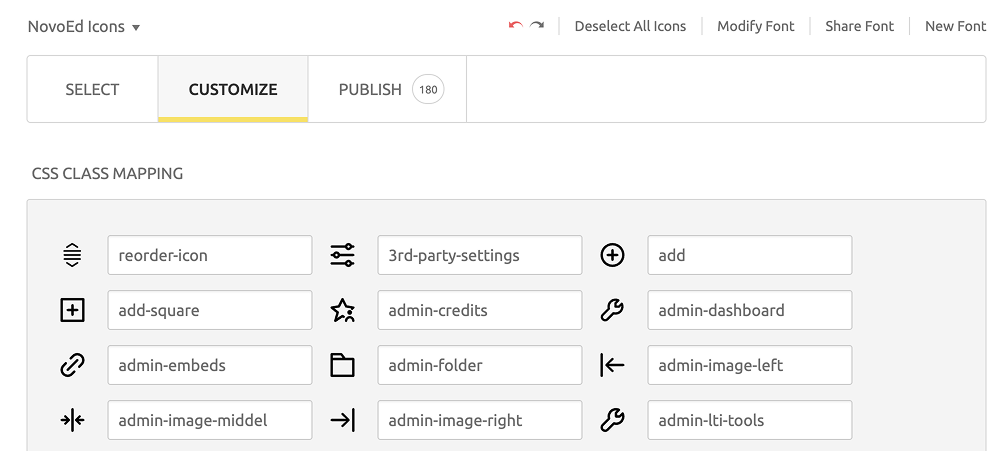
Convert SVG to Icon Font
Use an icon font generator tool such as Fontello, IcoMoon, or Fontastic.
Upload your SVG files to the tool.
Customize your icon font by selecting the desired icons and checking the CSS mapping.
Download the generated icon font package, which includes font files (such as .woff and .ttf) and CSS for embedding.
Integrate the icon font into your project by including the font files and referencing CSS classes.
This workflow ensures that your icons are scalable and can be easily styled as fonts in web projects.


Color
Color Inventory
The primary colors, including Blue-100, Red-100, and Green-100, are derived from production standards and are primarily utilized for key elements such as CTAs, warning indicators, and success messages. Building upon these main colors, I have expanded the color palette by creating additional shades to accommodate border usage and ensure alignment with broader design requirements.
*Example: blue-100 (a mid-tone blue) or red-05 (a light-tone red)
Ensure Accessibility and Scalability
Test the proposed token system for accessibility compliance (e.g., color contrast ratios for text and surface).
Ensure the system is scalable to accommodate future additions or modifications without disrupting the structure.

Color Naming Taxonomy
Research and Visual Analysis
Research and Conceptualization
After reviewing various naming systems and examples, focus on key concepts that align with NovoEd's needs. These include clarity, scalability, consistency, and relevance to the brand identity.
Disassemble Current Components
Break down the existing color system into its fundamental elements. Identify the primary colors, secondary colors, and any additional shades or tints used across the platform. Document their current usage, purpose, and any inconsistencies in naming conventions.
Finding the Right Taxonomy
Analyze the Need for Taxons
Taxons are critical for organizing and categorizing colors systematically. Evaluate the necessity of grouping colors based on:
Property: Define whether colors are used for primary actions, alerts, backgrounds, or accents.
Level: Determine the role of each color in the visual hierarchy (e.g., primary, secondary, tertiary).
State: Define colors for actions that may have states like active and disabled.
Variant: Define colors for information that may have variant like success, warning, and danger.
Propose a Naming Structure
Based on the analysis, develop a structured naming convention. For example:
Include Property names (e.g., "Text", "Border", "Surface").
Add Level (e.g., "Primary", "Secondary", and “Tertiary“ for visual hierarchy).
Evaluate the concept to determine whether the visual element serves as an action or a piece of information. For Actions, the following naming convention will be State (e.g., “Active”, “Hover”, and “Disable” for CTA). For information, the following naming will be Variant (e.g., “Success“, “Warning“, “Danger“ for message types).
Documentation

Document the color token and create a Figma Variable for the design team to use.
Each color token will follow a consistent naming convention to improve clarity and usability. The format will include the token name and its corresponding color value for easy identification by designers.
Color Token


Components [In Progress]
Visual components include button, chip, list, inout box, and so on…