CAKE Restaurant Management System - a Sysco project

Brief

Goal & Audience
Our goal was to create a business solution that would help restaurant owners better understand their revenue, customers, and staff. We visualized the data into charts that were intuitive to the restaurant owners.

Strategy & Tone

Reliable, trustworthy, and easy-going, I feel like I can have a conversation with a trusted friend and get insight from them when I want to make a big decision.
Requirements & Constraints
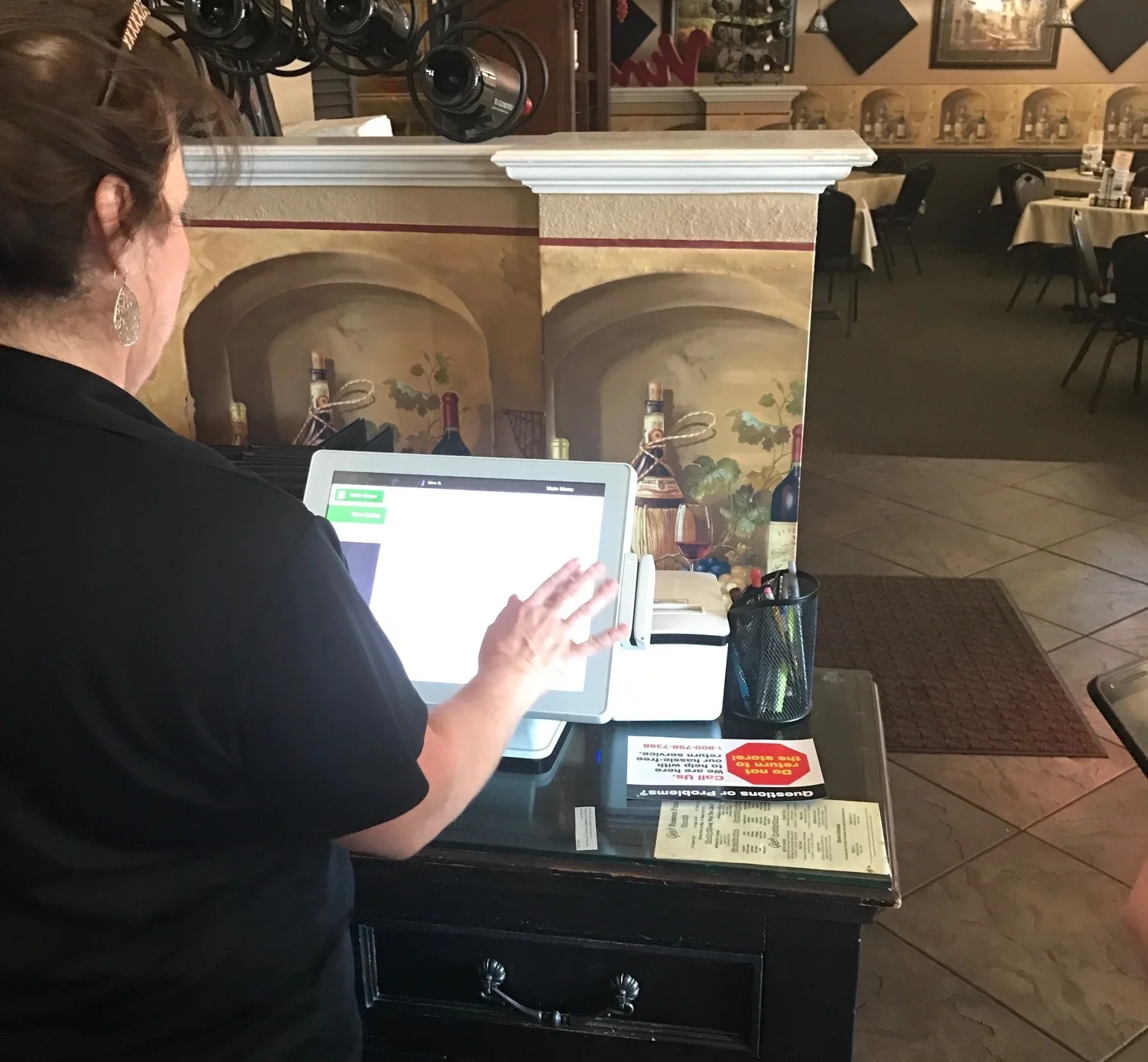
AS A USER
I want to glance at the update of my business today, this week, this month...
I can quickly get the information to help me make the business decision.
I can access POS, Guest Manager, and Cake's Online Ordering to make changes when need.
CONSTRAINTS
The data should be from POS, Guest Manager (CAKE online waitlist app), and Cake's Online Ordering app, which covers revenue, customers, staff, and menu information. Users also need to be able to change the settings for these apps.
Competitive Analysis
The dashboards of three competitors showed their pros and cons. I evaluated them from both the design and feature perspectives. Therefore, I learned from their strengths and discovered our opportunities.
Kounta
Highlight the total sales by big digits.
Square
Left nav-bar to coordinate with tertiary navigation. Consistent page layout.
Avero
Customized dashboard
Design Evaluation

Feature Evaluation

Our Opportunities

Fully functional support for all kinds of restaurant types. (CAKE covers all the features compared with other suppliers)
Responsive design supports mobile and POS machines
Getting To Know Our Users
Feedback Of Using Reports
USER 1: Zola Restaurant (Palo Alto, CA)
BACKGROUND
Guillaume is the owner.
He has used many different POS systems in the past.
FEEDBACK OF USING REPORTS
Logs into the Restaurant Admin tool daily.
Net sales is the most important number for him.
Never scrolls down on the left navigation.

USER 2

BACKGROUND
Tea House & Gift Shop
Single POS Operator
FEEDBACK OF USING REPORTS
The item Sales report is the most used report by the General Manager.
Needs sales comparison for 10 mos or 1-year.
The operator could not figure out the trend charts, which is in Insights Reports.
USER 3

BACKGROUND
Rosenda, owner
Has two locations
FEEDBACK OF USING REPORTS
Rosenda looks at Reports once a week.
Wants to compare Item Sales, ex. Tacos vs. Burritos.
Needs to advertise items based on sales reports to get higher margins.
He solely relies on Cash Closed’s receipts to see item sales.

Feedback From Customer Support
BACKGROUND
The CAKE support team helped restaurant operators to use the system.
Some operators try to compare the Sales Summary with their Payment data under the POS Payments Report, but they have different data sets.
Many customers called to ask how they could view a payroll report. We just direct them to Reports—Employee Clock In/Out, Tips, and Declared Tips, but this situation comes up often.
How to select a time for reports.
User Scenario
The user journey started with users’ desire to view net sales for a single day, week, month, or year. I began drawing the user scenario from here and dived deeper to see what users might want to see. Eventually, I broke it down into different stages.
Restructure Hierarchy
Categorize Competitor's Report Sections

Regrouped Categories
Sales
Franchise
Refund & Void
Menu
Labor
Revenue
Payments
Promos
Customer Engagement
Accounting & Deposits
Missing Contents Evaluation (Effort/ Importance)
Missing Contents
Cash drawers reports
Chargebacks
Accounting statement
Accounting
Deposit overview
Employee productivity
Modifier details
Item details
Payment reference (promotions)
Promotion detail
Sales by meal period
Top 10 Contents From Google Analytics
I looked at page views, active users, and duration in 3 different time sets to generate the top 10 pages that users visited the most.
Summary
Employee Clock In- Out
Sales
Item Sales
Sales vs Labor Costs
Sales by Category
Payments
Declared Tips
Cash by Employee
Tips
Problems with Old Reports
Blank Page
Old Reports showed a blank page by default, and users needed to select a report first to see the detail.
Long Navigation
Navigation was longer than 2 pages, users often ignored the remaining reports, which were also useful.
Two Payments Pages
The Account Balance from Payment Reports was the payment from a restaurant to Cake. The other payment information was the payment from the patron.
Duplicate Information
Some pages had overlapping information with a different format.
Navigation Solutions with Reports Section
Learning From User Testing
Date Selector Iterations
I gave users tasks ex. asked them to see last week’s total sales, yesterday’s transactions, then I noticed it was hard for them to find the date selector. After two iterations, the third version solved the problem.


Toolbar iterations
After I had tested and combined the header with all types of contents, I realized that it was better to move the time switcher (Hourly/ Daily) to stick with charts instead of considering it the same as other functional tools on the toolbar.

Header Adaptation on different sections
After testing the header’s usability, I considered all uses for different content and designed a flexible header for various content. Ex. tabs/ no tabs, a call to action button/ without the button...


Reports - Data Visualization & Final Look
Scopes
Displaying the information based on user’s need (we got insights from user interview)
Creating a logical information architecture for users to get the granular content when they need it. (The result showing by the page hierarchy and display by, filter by functions. )
Showing the aggregated data in all the summary pages and link it to the transaction page when users want to see everything at the transaction level.
Descriptions
Total Sales
Now the total sales number showed by default with a line chart that displays the trend of a day. Users can switch it between a bar chart.Date Selector
Date Selector now can do the time comparison and has a shortcut for quick selection.Filter
DisplayBy + FilterBy dropdowns provide granular information by showing aggregate data in charts.

Components and Charts


Result


Menu Tool Revamp
Old Menu Tool
The old Menu Tool displays a narrow item list, a navigation bar on top, and many action buttons. Users must select an item to see the details on the right.
The top navigation only shows three menu types: Items, Modifiers, and Categories, and it hides other types and functions in the more button.
New Item, Copy Item, POS Preview, and Publish buttons are permanent, taking a crucial space without frequent usages.
New Menu
Item details on the data table to show more item info by default.
Show all the menu sections on the left secondary navigation and move some low-frequency functions into the setting section.
Combine action buttons into one, and use a slider to show the options and functions. Click each row to call out the slider so the user can view and edit the item.
The bulk edit function allows the user to edit multiple items at the same time.
Old Portal VS New Dashboard
We launched the new Reports section within a new dashboard combined with other sections (ex: Staff, Menu, Multi Locations) as a new product. And we received compliments from our customers.
Product Introduction➡

Old Admin portal
Different sections with different interfaces and URLs are linked from the admin portal.
The old admin portal list all the contents without hierarchy and the different interfaces confuse the user to navigate from page to page.
Because each section has its own interface, learning to operate the system is hard for users.
New Dashboard Homepage
On the redesigned CAKE Dashboard, users can view the most essential reports when landing on the homepage and navigate to a different section by the left navigation.
The dashboard is customized, which users can pin modules from other pages to the place.
It’s convenient for busy restaurant owners to glance at the most relevant information according to their needs.
What Our Users Say
The owner of Buzz Coffee at Oak Park, IL. He tried the beta version and like the dashboard a lot!
Password: zorawan