
News Break
Background & Goal
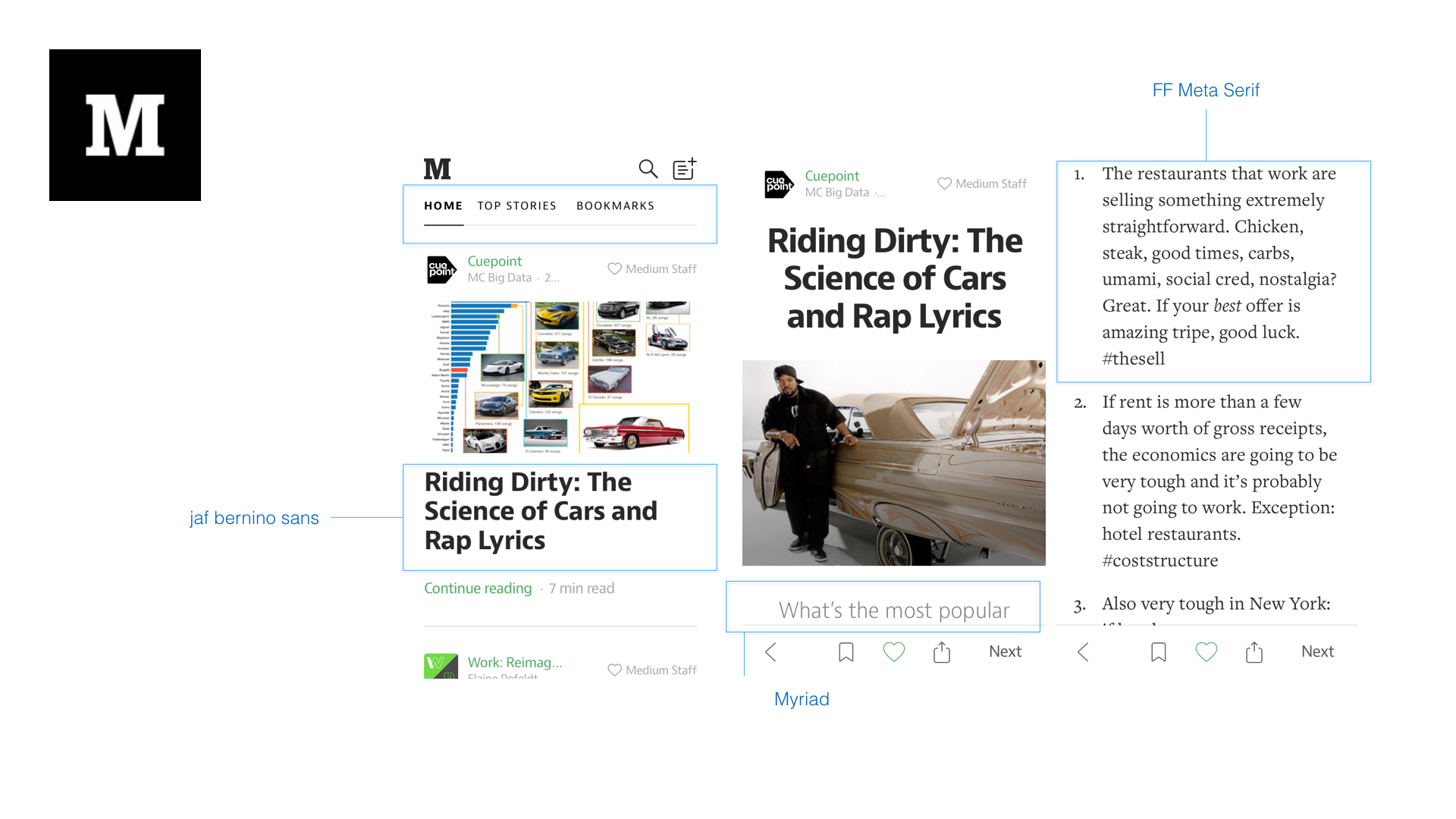
Created a personality (branding) for the app by translating the app from Chinese to English and launched it within two weeks. Also added a feature to view the original articles. Furthermore, we iterated the app by learning from users then redesigned a better version based on the first version.
My Role
First release
Market Research, Competitive Analysis, UI Design
Iteration
User Flow, Wireframes, Data Analysis, User Testing
Process
A different approach
UI - Article Page (Quick View & Web View) Brainstorming
The experience without ads and any disturbing


UI - Font Usage Research


Proxima Nova
Legibility
★★★★★
Flexibility
★★★★★
Showmanship
★★★★★
Amphibiousness
★★★★☆
Readability
★★★☆☆
Classiness
★★☆☆☆
Proxima Nova on Article Page
Launched in Apple Store and Google Play


Iteration 1 - India Now For Android
Design goal
Business goal
As the only designer, I set a goal to make sure the user flow is simple and easy to understand, and I created a delicate visual style. By doing so, I needed to remove the customization for Xiaomi (MIUI) from Android.
Our business goal was to create another app for the Indian market to test our assumptions. See if we could engage users by increasing page view and section-time.
Assumptions
1
2
A standard layout from the material design guideline was better.
The quick view was not only a better format but also faster than loading a web page.
3
4
The quick view was not only had a better-looking layout but also faster than loading a web page.
Instead of encouraged users to see more content, we wanted users to share articles directly.
How
1
I created the layout based on the material design guideline. We want to compare it with a customized layout.
2
We tracked the click rate on both versions to compare the improving rate.
3
I created tags that show users' interesting keywords in the article screen, so users could see more related interests by taping the tag.
4
I Added share and like buttons on the card in the mean stream. So users could make actions without reading it.
Bonuses
I created relevant content, such as cricket scores.
I created small image cards and no image cards for low data plan mode. So users were able to switch between different views depending on their internet condition.
I created a night mode because it was more comfortable for night reading and battery friendly.
India Now - Your personalized news app.
The more you read, the better you get!
See news base on your interests, including local news and unique interest stories.
Explore thousands of topics as we add millions of articles to the app every day.
Support Hindi language, hundreds of Hindi publishers in the app.
Prototype - Android For User Testing
By competing with Google Newsstand, I wanted to analyze if the material design fits the concept. The easiest way to redesign the app is by following the material design guideline. Therefore I tried to standardize our app and make it looks like an Android app then tested it.
User's feedback ★★★☆☆
Pros
It's easy to understand the navigation bar on the top. And users did scroll a lot.
Users liked the recommendation options on the search page.
Users liked big images.
Users did tap the favorite button on the article page.
Users liked the comment page. It looks clean and easy to use.
Users’ comments: Concise and simple
Cons
Users didn't like the doubleheader, it covers too much space.
Users didn't want the floating button when they scrolling down.
It was not clear for users to edit their favorite topics.
Users didn't expect to see font size setting in the more button on the top right corner.
Users didn't understand the button "view on web."

Iteration 2 - Stream Page
The experience with efficient glance and quantity sources
Business Goal
We wanted to engage users by increasing page views and duration. And made a single version to support U.S. and India market (only Android) so we won’t need to maintain two versions.
Design Goal
I wanted to make the user flow, which is simple and easy to understand.
How
I defined the user flow to guide users to consume more articles within a complex app structure.
Challenge
We got low retention from the list view compare to the article view. It means there is no motivation for users to return to the list view. And more users who came from notification will exit the app after reading the article.
Brainstorming for User Flow
Flow 1 showed the traditional reading flow from some main news app. Flow 2 showed the new idea for Particle News, which encouraged users to go back to the list view to consume more headlines and articles.
Details for the flow 2
Based on flow 2, I added the onboarding, setting, explore, and channel screens to the flow. The colors showed different status from our working process at that time. It helped us to track how completed the app was.
Iteration 3 - Refine Navigation
This iteration was based on the user feedback we got. To improve the previous version, we needed to refine the navigation. The actions included reducing the header space and moving the search to a explore tab and using a setting tab instead of the more button.
Ideate - iOS Video Concept
We launched this app in the Apple store called News Break
Local News
Used pull to refresh the location.
Showed the blue dot on Me icon on the bottom bar if there is any push news.
Your following topics
Added a related video or gif image on the top of the screen.
Showed a general article if the topic is a long-tail content that didn’t have related video.
Explore
Scroll down to shrink the search box to a floating button.
Swipe the carousel on the top to see more recommend topics.
Tap the plus button to book the topic.
Tap the image to see the detailed introduction and related content about the topic.


News Break-
Your personal news app
News Break on Google Play Store
After iterated the interaction for a couple times, we also launched some different concepts to test the market. Eventually, we decided to keep News Break as the main app to continue our journey.

