POS Payment System - A Sysco project
Background

What’s our goal?
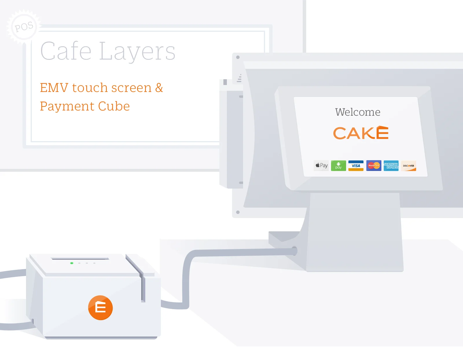
Helped small restaurants to do the counter checkout, we built a payment cube that allowed consumers to pay by card and mobile device. Therefore, we needed to update the CTD (Customer Touch Display) and added new instructions to help consumers complete the payment flow.
Who's in the process?
This user flow is experienced in the counter restaurant when consumers pay with orders. And also in the fine service restaurants when consumers wanted to pay by mobile phone.
What are the challenges?
Introduce new hardware brought usability issues to consumers.
The cube was separated from the touch screen.
Consumers didn’t seem aware that the payment cube existed.
Even though consumers noticed the payment cube, they didn’t know how to use it.
Survey In The Market

Experience Square with mobile payment
I used ApplePay in the counter of a coffee shop. The cashier held the NFC reader and waited for me to authorize the payment.
Customers were not able to see the item list and subtotal until payment was authorized.
It had payment type stickers (Visa, MasterCard...) on the machine.
Experience Clover
I pay with my credit card, and the cashier swiped the credit card then rotated the screen to me.
It had a vertical screen
Customers were not able to see the item list and subtotal until payment was authorized.
It had payment type stickers (Visa, MasterCard...) on the machine.
It didn’t have a finish (thank you) screen. The last screen showed a rotated indication.
Experience in a grocery
This was a widespread credit card processing machine. There were four parts of information:
Logo
Usually with welcome text before scanning items.
Shopping Details
After items had been scanned, a list appeared. Notice the scrolling bar on the right. It’s scrollable if you want to check previous shopping items.
Accept Payment Types
Three icons indicated the NFC function.
Total Amount
The total amount, tax, and subtotal.
Experience Revel and pay with a credit card
I handed over my credit card to the cashier for my payment.
Customers were able to view the total at the same time when the cashier was processing the payment.
It didn’t have payment type stickers (Visa, MasterCard...) on the machine, either no indication on the consumer-facing screen.
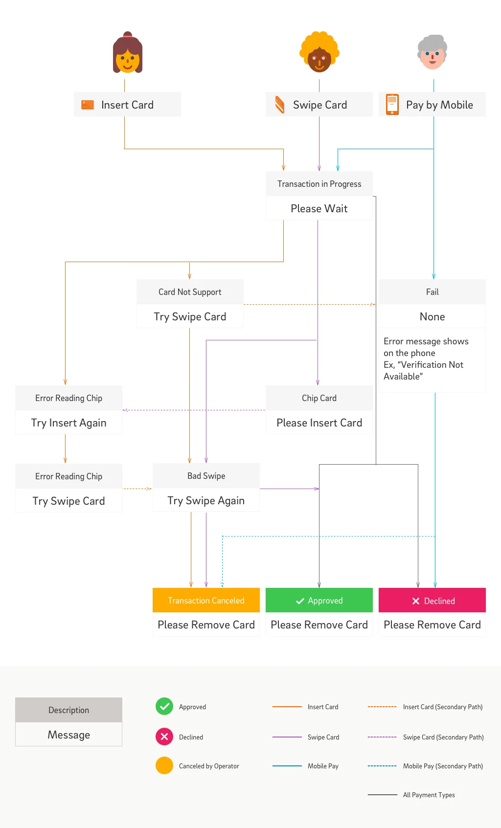
User Flow
The concept covered general and extreme cases during the card reading process.
General Cases - As A Customer...
I should be notified that I can swipe/ insert a card, and I should be told whether I can use mobile payments.
I should know if the machine accepts the payment type I am going to use.
I don’t want to forget my card after inserting it.
Extreme Cases - As A Customer...
I should be instructed to swipe my card if there was an error reading the EMV chip.
I should be instructed to swipe my card if the AID (Application Identifier) on my card is not supported.
UI Mocks


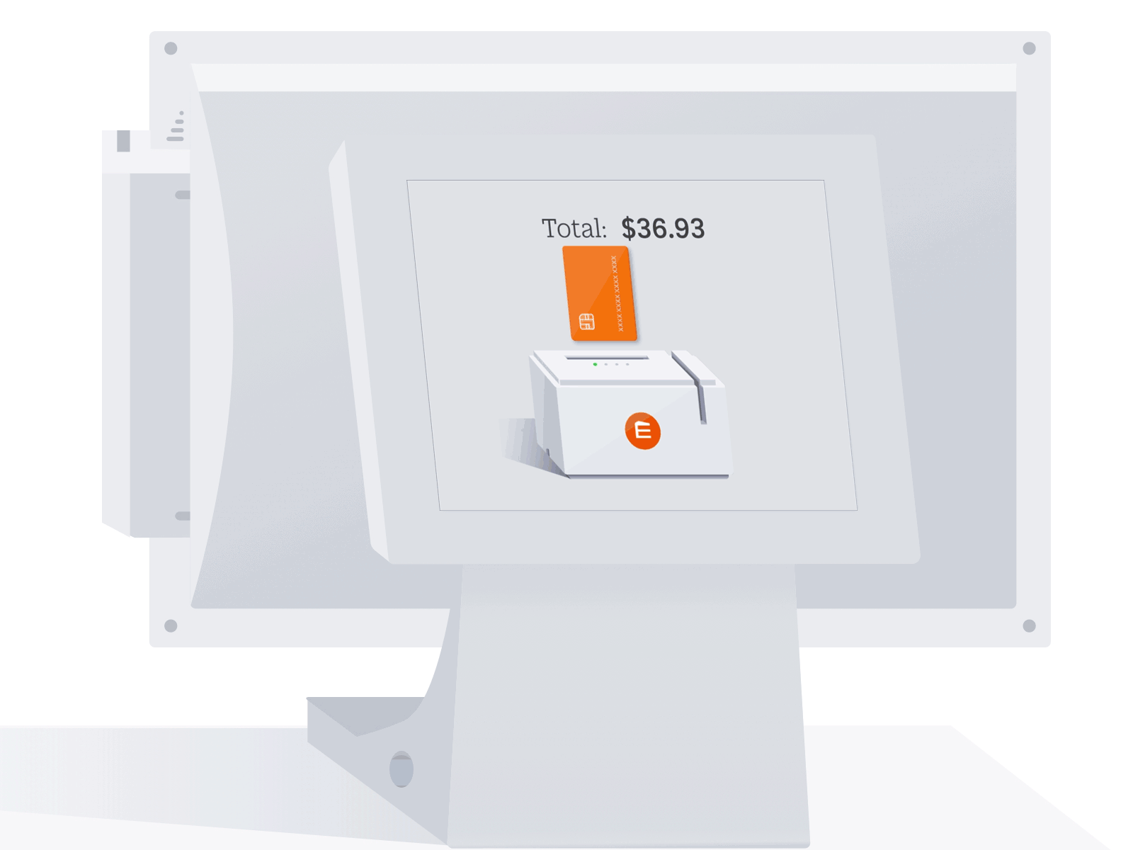
An animation on the total screen shows the total amount and indicates the actions for inserting and swiping.
Show the payment cube, so customers understand the CTD (Customer Touch Display) isn’t the card processor, so they will look for the payment cube to complete the action.
Keep the total number on the top of the screen, so customers are always aware of the amount they are paying.
Show an insert or swipe card as primary options on the screen. And show the NFC icon on the payment cube. Because most customers pay with cards. The customers who have a strong intention to pay by mobile phone will look for the sensor when they see the welcome screen.
