Sysco Cake Design Guideline
My goal was to build a design guideline for CAKE branding. This design guideline gave all our products the same look and feel, and it also helped different teams in the company to have the same language to communicate with each other. I started this project from scratch by myself then eventually, everyone in the company got involved and were able to talk about their own projects by using the guideline. The Cake design guideline was used for four mean products: CAKE Point Of Sale, Guest Manager (reservation app), CAKE Online Ordering, CAKE Universal Admin.
Typography
My job was to define the font width, color, size, and line-height for all the text we used in products. Simultaneously, I needed to make it a combination so our engineers could reuse it.
The font usage
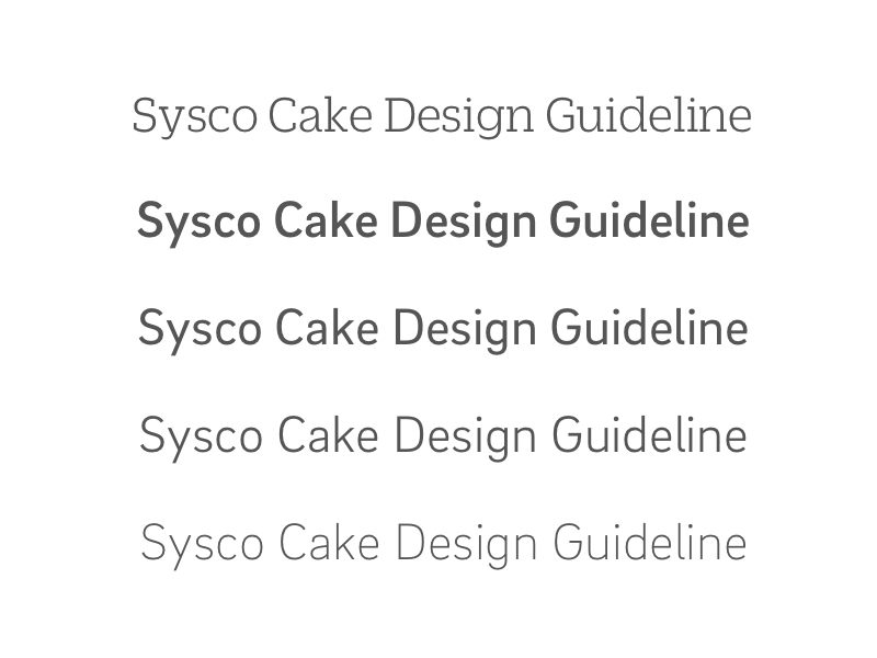
DuplicateSlab
Light: 100
BrixSans
Medium: 500
regular: 400
Light: 300
Extra light: 200
Scenario
H1{height: 48px;width: 190px;color: #5F5F5F;font-family: "Duplicate Slab";font-size: 48px;font-weight: 100;letter-spacing: 0.86px;line-height: 58px;}H2{height: 28px;width: 218px;color: #5F5F5F;font-family: "Brix Sans";font-size: 24px;font-weight: 500;line-height: 28px;}p{height: 17px;width: 329.13px;color: #5F5F5F;font-family: "Brix Sans";font-size: 14px;font-weight: 300;letter-spacing: 0.25px;line-height: 17px;}Looks and Feels

Iconography
According to our products’ needs, I needed to create icons across different products and platforms. And these icons were able to been used by teams. Therefore, I made the User’s Guideline and Creator’s Guideline. For stakeholders, the User’s Guideline helped them to use it according to their needs and still kept the same style and feel. Therefore customers could felt consistency across Cake branding. For designers, the Creator’s Guideline defined the workflow and made communication easier.
User’s Guideline
Everyone in the company was able to grab icons from the icon library when they needed it. It saved designers’ time to generate an icon and also saved time for communication. By delivering the SVG file, users were able to use it for a variety of sizes. But followed the size guide below, users could have gotten the best result for digital display.
Web Size Usage

iOS Size Usage

Android Size Usage

Creator’s Guideline
Followed the guideline, even though different designers could make a contribution. Therefore, it kept the branding consistent.
Original Size: 24px (Create icon base on the size)
Mobile: the status needs to include normal (#A8A7A4) and tap (#5F5F5F), so it will be 4 variations in total for an icon. Use Carrot color as a call to action color if the icon needs to be highlighted.
iOS: 29px as 1x
Android: 48px as 1x
Web: the status needs to have normal (#5F5F5F), hover(#A8A7A4), click(#5F5F5F). so it will be 3 variations in total for an icon.
Size: 24px as 1x

Use the outer square for circle objects, and use the inner square for rectangle objects.

The name card icon is used for representing the Staff section in the CAKE system.

Size & Style

Shape & Outline

Weight

Details

Background

Icon Library
I created more Than 170 icons in the library. It was about 150 on my own, and worked with other designers for the remaining.

Color
Branding Colors


Main Colors
These were all the colors that had been used for all the products under the CAKE branding. Based on the branding, the carrot was the primary color for all products. It also was the call to action color for buttons, links, and tabs.


Color Inventory
This color inventory gave different products to their own personality. Different products could choose some colors from this inventory to present graphics, charts, illustration, animation… but these colors should never have been used more than 10% from all the color selection. For example, in the Universal Admin (the restaurant management system), the reports section needed multiple colors to represent different items in a line chart. Designers could pick colors from the inventory and generate the line chart, but they shouldn’t use them for the action button, either for text color.


